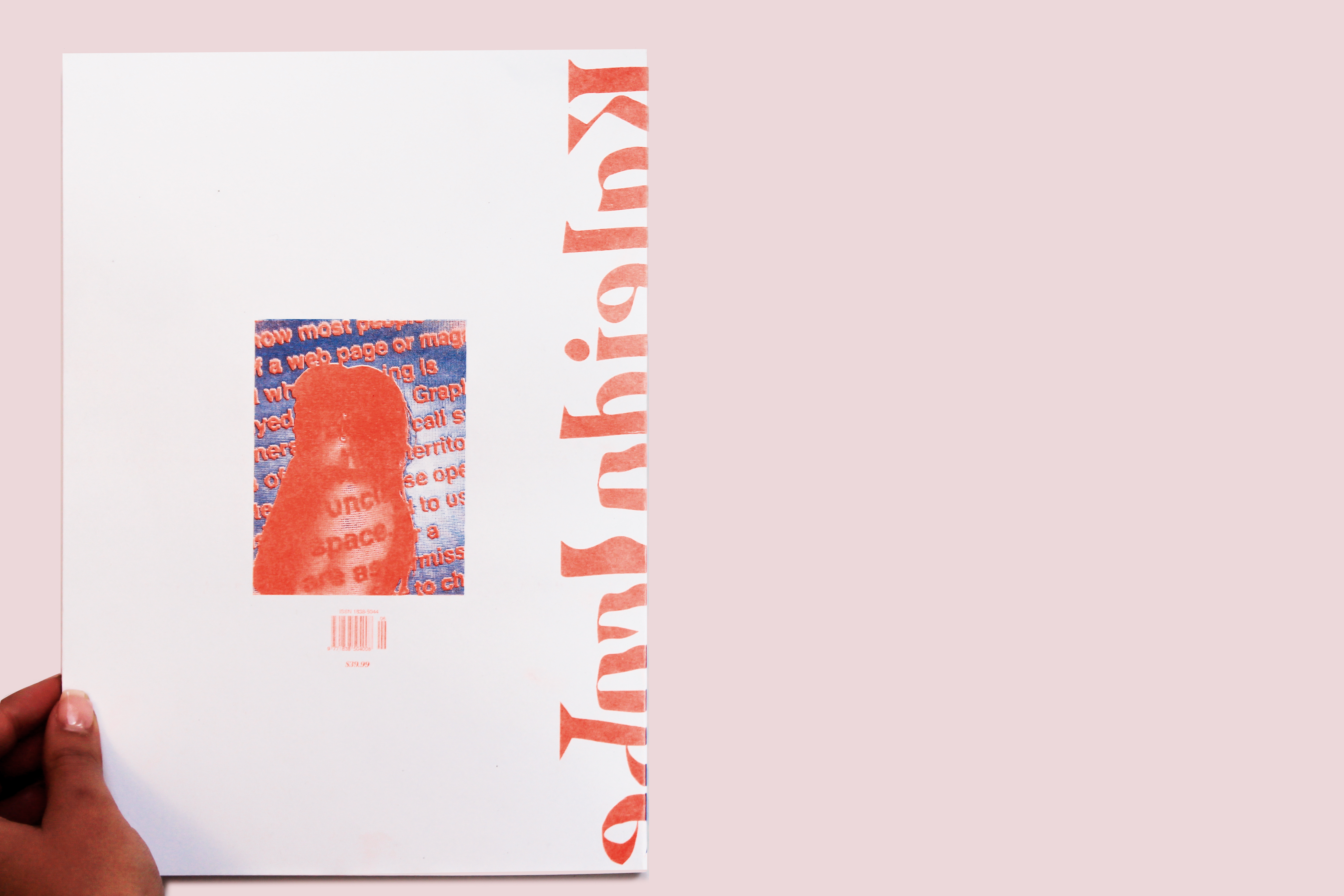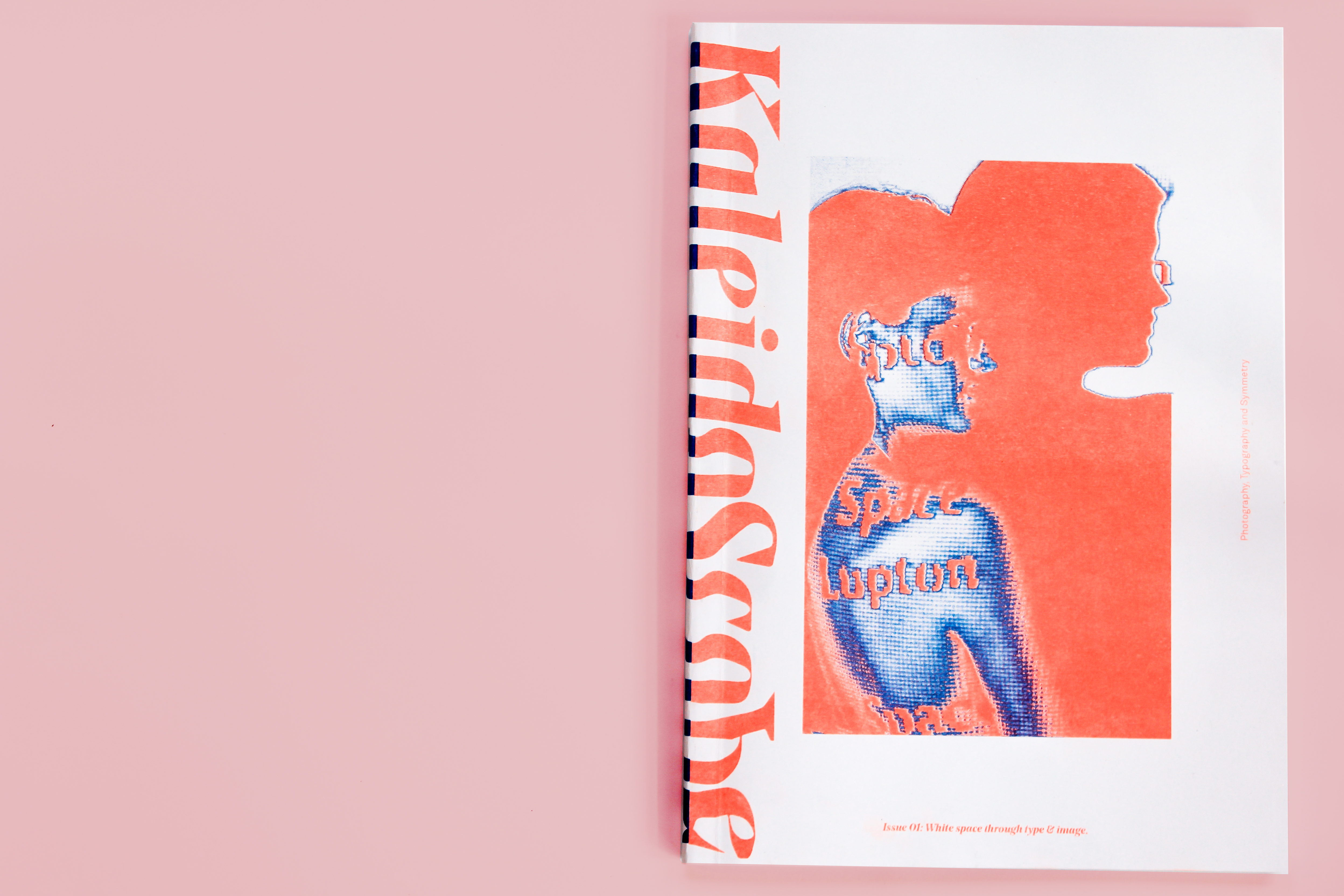
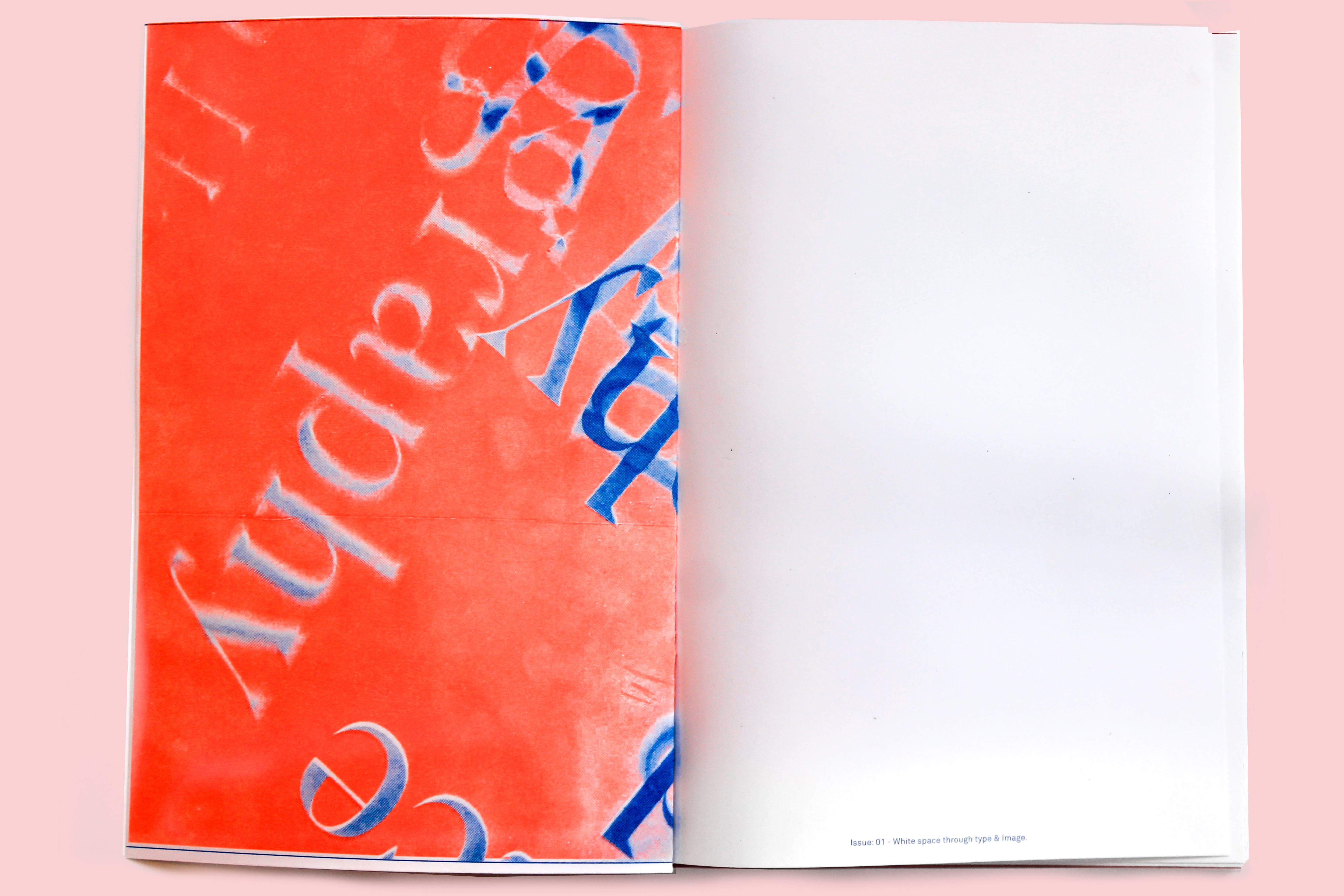
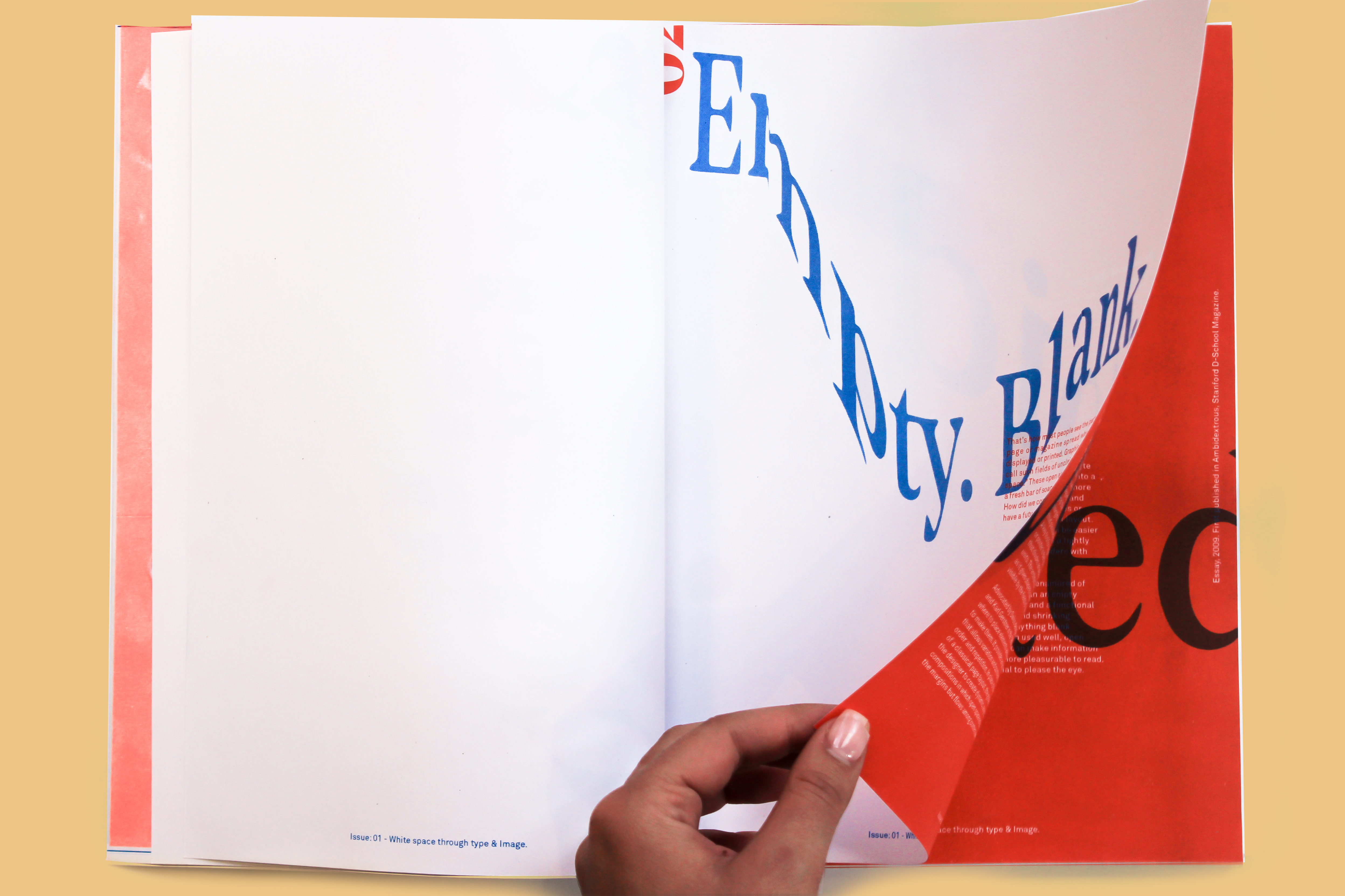
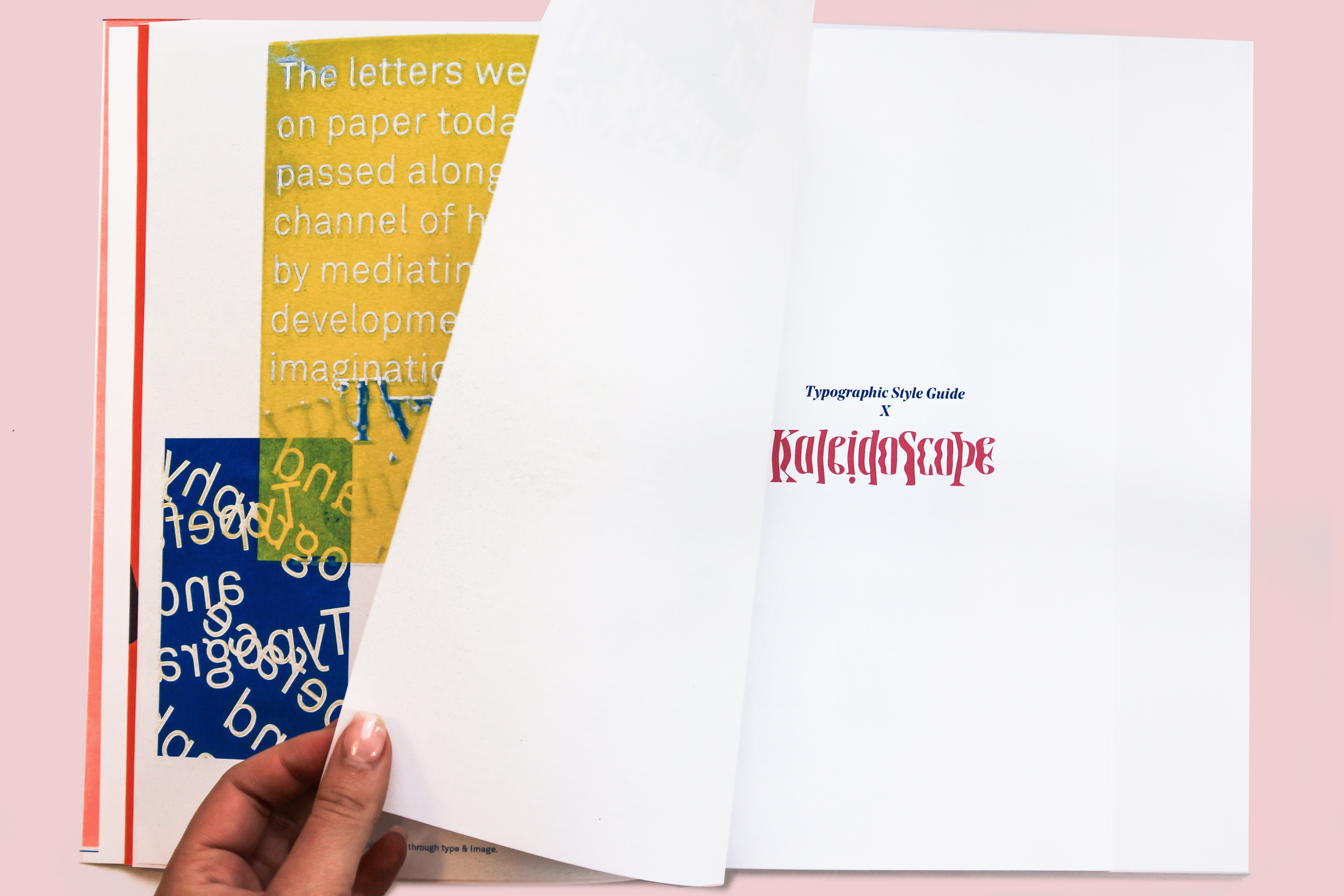
Kaleidoscope is a magazine which focuses on experimental typography and photographic techniques. Each spread stays true to the content, through using images, white space and typographic conventions to draw the attention of the audience. The magazine is aimed at a audience which is interested in speculative design techniques and creative content. Through the use of staying true to a grid structure whilst having intriguing typography, the audience is able to make the connection between imagery and information.
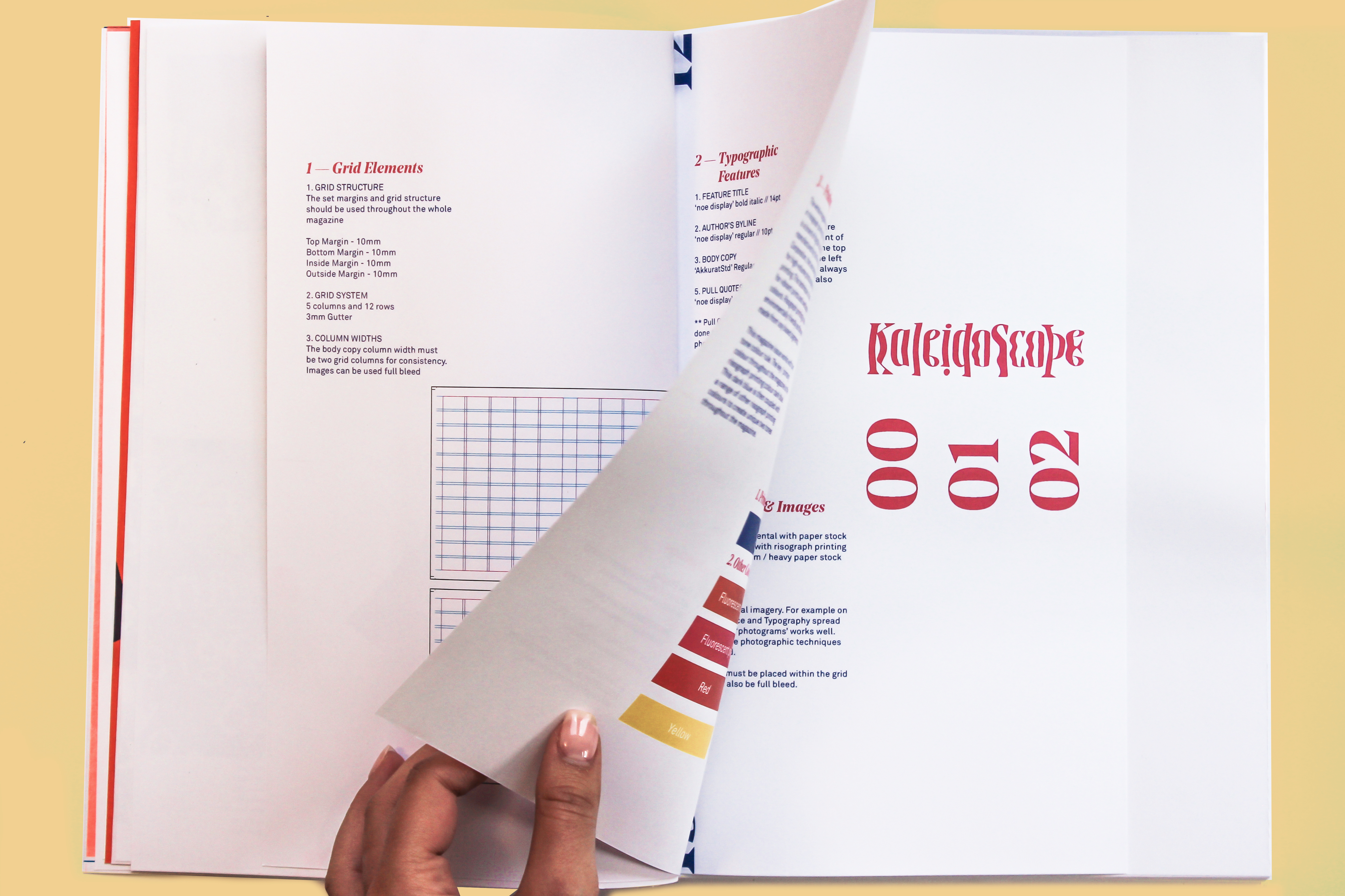
The use of the risograph printing technique also stays true to the tone and aesthetic qualities of the magazine. Through using a key spot colour and interchanging that with one other risograph colour, it allows unity within the spreads whilst also captivating the audience with each turn of the page.